Wednesday, 17 December 2014

Typography

 Typography is the art and technique of  to make written language most appealing to learning and recognition. The arrangement of type involves selecting typefacespoint sizeline length, line-spacingletter-spacing , and adjusting the space within letters pairsType design is a closely related craft, sometimes considered part of typography; most typographers do not design typefaces, and some type designers do not consider themselves typographers. In modern times, typography has been put in film, television and online broadcasts to add emotion to communication. There are two basic fonts, serif and San serif used for magazines, the use of the fonts vary from different magazines, serif is more formal and harder to read, where was sans-serif is more blocked and easier to read. 
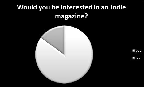


Social Media Opinions

For more advice, I asked my instagram followers which possible titles, in their opinion, they thought was best. I thought this method would be most useful as my instagram followers are aged between 15-18, which is the typical audience age of an indie rock magazine. The results I got back, were once again at a majority based on 'IRM', therefore I will be using this title when creating my music magazine.


Friday, 12 December 2014

Interview

For further information and advice on my music magazine. I interviewed an level media student, Yasmin Osman, on thoughts, criticisms and ideas about the ideas on I had for my magazine.
The questions included:

  1. What is your opinion on creating an indie rock music magazine?
  2. Would you personally buy a indie rock music magazine?
  3. What are your opinions on the title 'IRM'? What does it suggest?
  4. Have you got any suggestions on what the main features should be based on?
  5. Have you got many more suggestions?
My opinion on Indie magazines is a alternative and different idea to typical music magazine ideas. This magazine will need to provide an alternative and unique approach as these types of magazines are extremely different compared to others. However, the idea of creating an indie rock music magazine is a good idea as you can be creative with this magazine and there are many ideas. This idea may be good also because this can relate to many audiences and is a very popular type of music currently.

Personally, my interest in music is very basic and I enjoy chart music. However, from your ideas with you expressed with me, this sounds like this magazine will result extremely well and does sound appealing to me, therefore it may be a possibility that I would a buy a indie rock magazine if it including artists I like or a feature which sounds interesting.

I believe the title 'IRM' is very basic, but it is a very relative idea to the type of magazine that you are creating, as indie rock music magazine have very basic titles. Also, i know how difficult it can be choosing or creating a title for your magazine, therefore I believe this is a good title to use as it sounds like a indie music magazine and would be very recognisable for the audience.

The main feature should be based on a famous indie rock artist as this would be more appealing to the target audience and would possibly sell more copies. The main feature should include something interesting and would stand out to the target audience. The main features also usually include interviews or an exclusive, which you should use within your magazine as this will be more interesting towards the readers.

I have no more suggestions as I believe you have everything in order and have a clear idea of what you want to create within your magazine. Good luck!

Answers To Questionnaire

Below are my answers to the questionnaire which I sent out to 120 people via social media e.g. twitter, only 100 people replied. These answers will help me when making my music magazine as i can take into consideration when creating my indie music magazine, as this helps me know what will attract buyers and interest the audience.


Questionnaire

This is a copy of the questionnaire, which was sent out to 120 people aged from 16-30 year old's. which is used to get final ideas on how my music magazine should be and what would attract a certain audience. 

Demographs

The audience demo-graphs of indie magazines, such as nme, are usually between 17-35, at a average of 25 years old. 73% of audiences are men of such indie magazines and are between the social grade ABC1, the audience are well educated and 34% are working full time, 18% working part time and 26% full time students. The readers of such magazines are modern, trendy and young, who typically interested in films and technology. This shows that there are readers, market and an audience for indie music and indie magazines:

Magazine Analysis (2)


The front cover is successful as the magazine has included all the artists included within the favorite bands theme in this issue, Dave Grohl has been placed forward and at the front as this emphasises he is the favorite and most important. The magazine is also successful as there are various strap lines, for example three posters and competitions. The puff of 'foo fighters' also relates to the text talking about Dave Grohl, making the puff line stand out to the audience, this will attract the readers as the magazine has used famous artists, which the readers will be interested in. The text is good as it has a 'rock' effect, as rock is seen as old and loud. However, the bar code is placed in an unconventional place which is different and looks out of place.

The contents page is successful as it has used a range of images and used the same theme throughout, following the conventions of a magazine. Also, the contents page is successful as it has been arranged into sections, such as news, gig guide, albums and ultimate rock star test, which makes the contents page clearer and easier to the reader to locate what they are looking for. However, there is no image of the artist which is featured on the front cover, therefore the reader will have a harder time to find the artist they are searching for.

 The double page spread is attractive as the pose and clothes of the artist relates to the star image of a rock star, the artist looks cool and this will attract the readers more, specifically because the artist is making eye contact with the reader. The double page spread is also successful as when the reader is browsing through the pages, it will become clear straight away who the feature is about as the image is large and the feature name is large and bold in the corner of the page. There is a theme within the double page spread which relates to the contents of the article, which makes the magazine more attractive, as the article uses the colour of the american flag, the artist is dressed in american colours and the text is decorated in american flag and colours, making the magazine article more interesting and attractive to readers.

Magazine Analysis (1)

The nme is an indie rock magazine, standing for new musical express. The theme is red and black which runs throughout the magazine. The image is successful as the band ‘kasabian’ looks cool and the magazine has used direct eye contact, interacting with the audience. The nme is placed in the same position as every magazine and used large bold writing at the corner of the page, standing out to the audience and making the magazine easily recognizable. The magazine front cover is also successful as they have used a range of artists, which would attract the audience more, such as Eminem, catfish and the bottlemen and kasabian.

The contents page is successful as it has a good use of the layout of the contents page as the magazine has laid out the magazine in sections and index, making it easier to locate sections of the magazine easily. The use of the page numbers is good as it is easier to find, rather than at the bottom of the page, it is different and doesn't follow the normal conventions of a magazine. The use of advertising at the bottom of the page is uses a comedic side, interacting with the audience. However, there is hardly any image which goes against the conventions of the contents page, as normally there is half of the page used by images.


The writing on the page is cool and harmonizing with the theme of the magazine as it is indie and different. The pull quote and section of the information about the artists is good, as it is laid out and stands out as it is large and been highlighted. However, there is not a theme which usually runs throughout the magazine, this goes against the conventions of the magazine. Also, the use of the bright yellow page is unsuccessful as it is hard to read and stands out when browsing through the magazine negatively, perhaps the magazine should have placed the artists more to the side, so then when browsing you should have seen the artists. At the top, it should say feature or the artists name bigger therefore the audience would be more aware of the band featuring. The double page spread is also unsuccessful as the band have not have a change of clothes, this makes the magazine more boring.


Thursday, 4 December 2014

Indie Music Magazine

A music magazine is a magazine that aims to provide its audience with the latest news, gossip, reviews and tour information. There are many different genres of music magazines due to all the possible audiences. The genres I am particularly interested in are indie rock or indie pop.  

Indie magazines promote independent music (often shortened to indie music or indie) is music produced independently from major commercial record labels or their subsidiaries, a process that may include an autonomous, do-it-yourself approach to recording and publishing.  They also promotes manufactured music too. 

The audiences of indie rock are  There are different style images for indie music magazines, for example Arctic Monkeys is a perfect example of a Indie type style of music, the band wear leather jackets, black skinny jeans. white t-shirt and sunglasses, this is an example of the English type of Indie music. An example of the American type of indie music star image would be the kings of Leon, who have a messy look with beards.

 Indie magazines are becoming increasingly common as the music is becoming more current and popular. An indie magazine will often include such a simple masthead and the this would typically be large and take up the whole top section. This is so it is easily noticed on the shelves of the shop amongst its other competitors. 

The main image would usually have a current band or musician as most indie music is aimed at the younger generation. The musician won’t be extremely famous however will be well known by the younger generation. 


The conventions would include a lot of puffs with other band names and current news regarding the indie industry. The images used would be graphic and abstract. The idea of indie is being independent and original and not conforming to the stereotypical music ideas. This is shown through their photos, for instance they are never usually happy however connote a unique seriousness. The colours would be dark and natural as indie is considered rock music however not as heavy and serious. This also reflects the magazine as it would be quite simplistic to show that indie music focuses solely on the music rather than the gossip or stories behind the musicians. It would not be crowded or cluttered as other magazines such as pop. 


Wednesday, 3 December 2014

Initial Ideas Of Music Magazine

The genre which I will be using for my music magazine is indie rock or pop as this is the genre of magazine I am personally interested in, therefore would have more experienced when creating the magazine itself and have a various amount idea I already want to use, The star image of the magazine would stereo-typically be a boy/man as this is usually the gender which is used within a indie rock magazine. The person should be wearing black jeans, indie clothing e.g. funky t-shirts or a white shirt, with the look of messy hair or a messy look. A perfect example of this star image would be someone such as Alex Turner (Arctic Monkeys) or Matty Healey (The 1975).

The fonts will be blockly, large and bold as this usually used on the conventions on a rock magazine, for example NME have large, bold font as their title. The colours that will be used are black, red, white, dark colours such as grey, burgundy or purple, this is because these colours are typically used within indie rock magazine themes such as NME, have a black and red theme throughout. These colours will also be used because it is vintage and cool colours which connotes aggression and suits the form of the magazine.

Ideally, my music magazine will be published weekly as this is usually the time period that music magazines get published. The mode of a address I will use is an informal, sarcastic and relaxed as this is usually the approach indie rock magazines use.


My possible titles for my magazine include 'IRM', 'R-M' or simply indie rock. I have found trying to find a successful and interesting title hard, however, these are the titles which I have finally decided. I believe these titles are successful as these mostly relate to indie rock magazines and will be clear to the reader that they are indie rock, as this is what the initials stand for, These titles sound like a professional indie rock magazine.