Showing posts with label Construction. Show all posts

Friday, 13 February 2015

Contents Page Change


I decided I disliked my first contents page and decided to change this by starting another contents page. I first started by making the paper to an international paper of A4 and starting the band index. After this, I followed the theme and conventions of my music magazine and placed the title in the left hand corner, by print screening the font of the website 'da font' and pasting from paint. I then created a shape on photo shop the match the size of the title and fitted at the top of the page. I then placed the band index at the left side of the page under the title to created a clear layout, therefore everything would be structured on my contents page, following the conventions of a music magazine.

I then placed a shape which was the colour black above the band index content. I placed font of 'da font' named bebas neue, as this looked successful on the magazine as it looked like a typical font used and rock type. I then coloured in the shape which was for the contents title and the title the same shade of red, as this made the theme of red, black, white and green consistent throughout my magazine. After this, I positioned the pictures to the right of the band index, to look more structured and fit together. I edited the title to have a drop shadow and embossed the title, also giving the title a stroke effect which gave the title a background of white to stand out more, this followed the layout of nme magazine as they give their title a stroke effect of a different colour.  Then I continued to do the different sections of each articles, features, news, radar, etc. Each section had a black shape the same width and length as others above the text, each using bebas neue as the font. For each section the title of each article was larger than the content of the text and made bold, the font used was Tiresias PC font at 14pt, then the content of each text was smaller and regular. At the bottom of the page, I used text from photo shop to include the contact of the magazine, to make the magazine seem more realistic and enables the buyers to interact with the readers, by also using images of logos from twitter and instagram. From following the conventions of nme, I made a small article of an insight of what the article would be about of Sami and highlighted the title, and used typical rock text. Beside, I included the editors letter as this if a typical convention of a music magazine, by placing a shape over the text coloured grey but changing the opacity to ensure the text is clear to see. This contents page is more successful than my other one which I first created, as it is more structured and looks more like a typical, successful indie rock music magazine. 


Front Cover

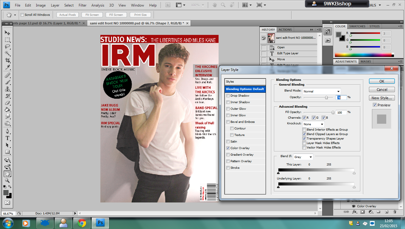
When making my front cover, I first started by making the page A4 on international paper as this is the size of a music magazine. I then placed a title on the same shade of red to follow a theme of same colours throughout my magazine, I gave the same effect as my contents page title to make a consistent theme on my music magazine and on typical indie rock music magazines, by giving a drop and the effect of a stroke with white colour. 


Then I created a shape at the top of the music magazine by using the rectangle tool on photo shop, using the same shade of red to make this consistent. I added text from photo shop on the shape as following inspiration from nme, they include a cover line on top of the music magazine, I also included famous artists as this would attract more buyers and interest the audience. I also used text from photo shop under neath the title to present what the title stands for 'Indie Rock Music' and issue number. 


I then started to include cover lines on the front cover of the music magazine, by following the conventions, I used black and red text for each of the content and title of each cover line. The title font is Myriad Pro and the content of the text in black is the same as the contents page as I followed a structure and tried to use the same text within my music magazine, as the font is Tiresias PC font at regular and the same sizes throughout the magazine. Then I created a black shape circle on photo shop by using the ellipse tool and included text of other famous artists. The tone of the magazine is informal and colloquial, for example 'pretty odd, pretty ace?' 


Then after I had finished the cover lines, I placed a grey shape over the text using the rectangle tool on photo shop and changing the opacity, so the the text is clear to see and makes the cover lines stand out more. 
Once, I had added the main story line and added the date, bar code and price to the magazine, by using da font for the title and the bar code. This was my final front cover, which I believe to be successful from following inspiration such as nme music magazine and the plan of my layout and ideas.


Thursday, 12 February 2015

Double Page Spread


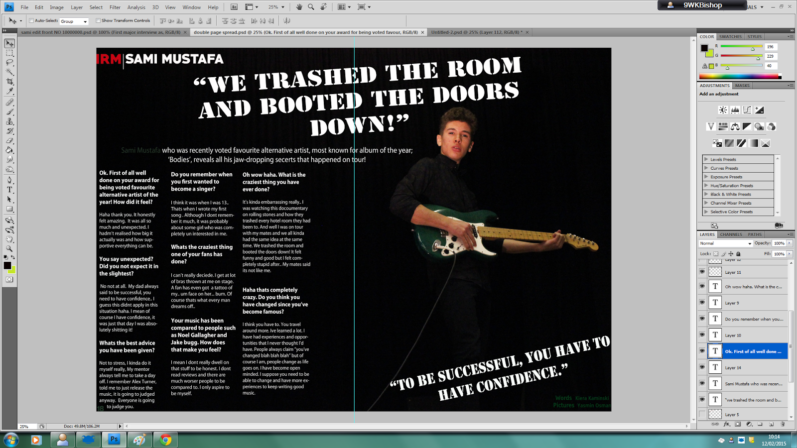
I recently started my double page spread which was the size of an international paper of A4 but doubled within width, I placed the image I took of Sami as a background as this looked good as he was to the side, which is used in music magazines and will attract more audience as when looking through the magazine they will see the artist. I started my placing the title of my music magazine in the corner, making the font red to stand out and following the theme of my magazine red, black and white. I made a pull quote after, which font is used from the website of da font, which quoted the interview by saying "We trashed the room and booted the doors down!" which is interesting to readers and will attract more audience more as this makes readers think what happened and this a typical indie rock quote which follows the conventions of music magazines. Then I placed the information about the artist, which is typically used in music magazines and this makes the double page more successful as if a person is unaware of the artist featured, they can read about them to recognise or be informed about the artist.  After, I made a line with the line tool on photo shop and text in white and bold of the artist name to make the artist stand out against the black ground. 

 Then, I started the interview with using white text from photo shop and making the questions of the interview bold and larger than the other font as this is typically used in music magazine interviews and this also makes the text stand out so it is clear to the readers. I placed the text around the artist, so the image looked more important and stood out on the double page spread. Once, I had finished the interview, I choose a pull quote again, placed under neath the artist as a inspiration quote. This was also font used on photo shop. When researching indie rock music magazines, I found that the people who done the words and took the pictures are mentioned within the magazine, therefore I included this as well, as this follows the conventions of a music magazine. I placed certain, small fonts in a dark green colour to match the guitar and to use another colour, which I found had to be included, as this makes the magazine more successful than just using three theme colours. 

I also edited the double page spread, for the artist to stand out more by changing the size of the background image, making the artist larger, to emphasise the importance of the artist. I also changed the brightness of the double page spread to make the article easier and clearer to view.

Friday, 6 February 2015

Contents Page Printscreen

This is my contents page which was completed today. I finished the contents page by finishing features and mentioning contact, which I created on social media as an instagram and twitter.I also included an editors letter, and used a picture of Sacha Relf, who is also an a level media student. I included the use of an curved arrow, which included text of the gig guide on certain page numbers. Most of my time went on correcting the page numbers, making sure they were in order and all related to the pages I designated each article to. The majority of these features follow the typical conventions of an indie rock music magazine, for example the use of a band index. 

Thursday, 5 February 2015

Contents Page Editing


Recently, I have been working on my contents page, I started this first as I believed this to be the most difficult as this has to include various content. I started with creating shapes to put titles such as 'IRM CONTENTS', 'NEWS', 'BAND INDEX' and 'RADAR'. Then continued to start the band index using numerous amount of popular artists and bands which are the genre of indie rock or alternative music. I used text within photo shop for the names in the band index and for the cover stories under the feature articles. Then, I created text on 'da font' website named harabara to create numbers for each page within the magazine. The text I used on da font for the titles of each article was bebas. Secondly, I positioned the different pictures on the magazine, after adding all the text, to each line up together. Today, I have been writing the cover stories under each article, from using inspiration of other indie rock music magazines and used original ideas to include for stories on my contents page.
 For the text I have used effects such as an bevel and emboss and putting and drop shadow on the text, for the writing to be clearer to read and stand out to the audience. In order to position everything correctly and symmetrical, I placed rulers on the page.