Saturday, 28 February 2015


Friday, 27 February 2015
Thursday, 26 February 2015
Question Two- Evaluation
How does your media product present particular social groups?


The genre of my music magazine is indie rock. In order for my magazine to be successful, the magazine would have to appeal to the target audience. The target audience is typically white British, aimed between 16 years to 25 years of age.
The male gaze is discussed by Laura Mulvey, this is used to describe how the audience is placed in to perspective of a heterosexual man. For example female characters are usually shown wearing hardly any clothing therefore they can be sexualised within the media. Alternatively males are shown on front covers as other males inspire to be like the successful males shown, as they believe they will become cool, get girls and rich. Therefore males buy the magazine to find more information on the artist, to become like them. They believe my conforming to the artist, as an example gelling their hair back and dressing the same as the star image, they will become successful as they get older like artists such as Alex Turner. The audiences of younger teenagers such as 16 year old boys are interested in getting with girls and the idea of being cool, therefore they will buy the magazine to conform to the genre, believing in a couple of years they will become this successful artist.
As an example Alex Turner conforms to the genre expectations as he typically represents himself as the star image as he dresses in white t-shirt and skinny jeans. Alex Turner conforms to look like artists such as Elvis Presley. Alex Turner is successful as he represents himself to look and be cool and fits within the target audience, white British.
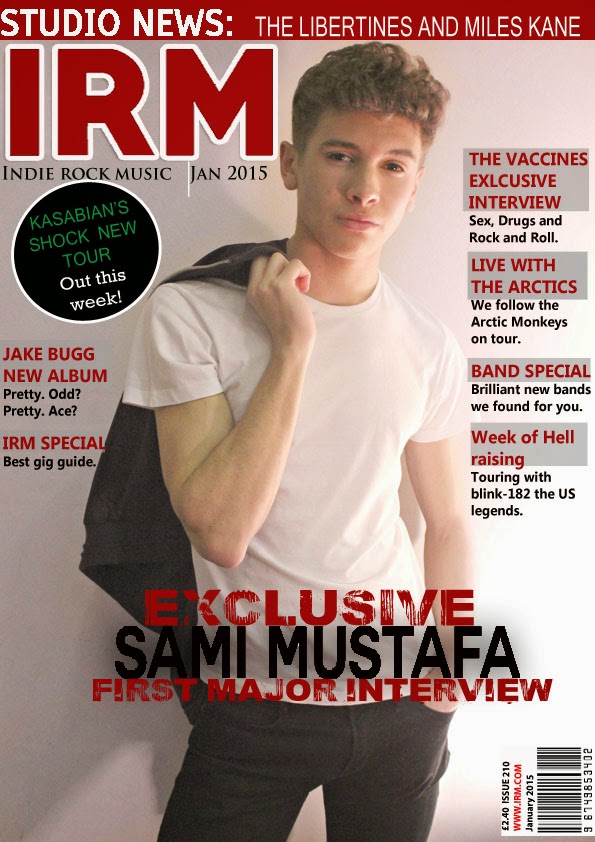
My artist represents these particular social groups as he conforms to the genre expectations of indie rock. I ensured that my artist is compared to Alex Turner, as they are stereotypically dressed the same, in black skinny jeans and a white t-shirt. My artist also conforms to this representation as he has product in his hair and is styled back, typically like artists such as Alex Turners. My artist is represented as cool by the pose he using, jacket slung behind his back and engaging in eye contact and uses the serious pose. These represent social groups as younger, target audience will inspire to be like this successful artist by buying the magazine and conforming to these genre expectations.
Wednesday, 25 February 2015
Friday, 13 February 2015


Contents Page Change
I decided I disliked my first contents page and decided to change this by starting another contents page. I first started by making the paper to an international paper of A4 and starting the band index. After this, I followed the theme and conventions of my music magazine and placed the title in the left hand corner, by print screening the font of the website 'da font' and pasting from paint. I then created a shape on photo shop the match the size of the title and fitted at the top of the page. I then placed the band index at the left side of the page under the title to created a clear layout, therefore everything would be structured on my contents page, following the conventions of a music magazine.
I then placed a shape which was the colour black above the band index content. I placed font of 'da font' named bebas neue, as this looked successful on the magazine as it looked like a typical font used and rock type. I then coloured in the shape which was for the contents title and the title the same shade of red, as this made the theme of red, black, white and green consistent throughout my magazine. After this, I positioned the pictures to the right of the band index, to look more structured and fit together. I edited the title to have a drop shadow and embossed the title, also giving the title a stroke effect which gave the title a background of white to stand out more, this followed the layout of nme magazine as they give their title a stroke effect of a different colour. Then I continued to do the different sections of each articles, features, news, radar, etc. Each section had a black shape the same width and length as others above the text, each using bebas neue as the font. For each section the title of each article was larger than the content of the text and made bold, the font used was Tiresias PC font at 14pt, then the content of each text was smaller and regular. At the bottom of the page, I used text from photo shop to include the contact of the magazine, to make the magazine seem more realistic and enables the buyers to interact with the readers, by also using images of logos from twitter and instagram. From following the conventions of nme, I made a small article of an insight of what the article would be about of Sami and highlighted the title, and used typical rock text. Beside, I included the editors letter as this if a typical convention of a music magazine, by placing a shape over the text coloured grey but changing the opacity to ensure the text is clear to see. This contents page is more successful than my other one which I first created, as it is more structured and looks more like a typical, successful indie rock music magazine.


Subscribe to:
Posts (Atom)