I recently started my double page spread which was the size of an international paper of A4 but doubled within width, I placed the image I took of Sami as a background as this looked good as he was to the side, which is used in music magazines and will attract more audience as when looking through the magazine they will see the artist. I started my placing the title of my music magazine in the corner, making the font red to stand out and following the theme of my magazine red, black and white. I made a pull quote after, which font is used from the website of da font, which quoted the interview by saying "We trashed the room and booted the doors down!" which is interesting to readers and will attract more audience more as this makes readers think what happened and this a typical indie rock quote which follows the conventions of music magazines. Then I placed the information about the artist, which is typically used in music magazines and this makes the double page more successful as if a person is unaware of the artist featured, they can read about them to recognise or be informed about the artist. After, I made a line with the line tool on photo shop and text in white and bold of the artist name to make the artist stand out against the black ground. 
Then, I started the interview with using white text from photo shop and making the questions of the interview bold and larger than the other font as this is typically used in music magazine interviews and this also makes the text stand out so it is clear to the readers. I placed the text around the artist, so the image looked more important and stood out on the double page spread. Once, I had finished the interview, I choose a pull quote again, placed under neath the artist as a inspiration quote. This was also font used on photo shop. When researching indie rock music magazines, I found that the people who done the words and took the pictures are mentioned within the magazine, therefore I included this as well, as this follows the conventions of a music magazine. I placed certain, small fonts in a dark green colour to match the guitar and to use another colour, which I found had to be included, as this makes the magazine more successful than just using three theme colours.
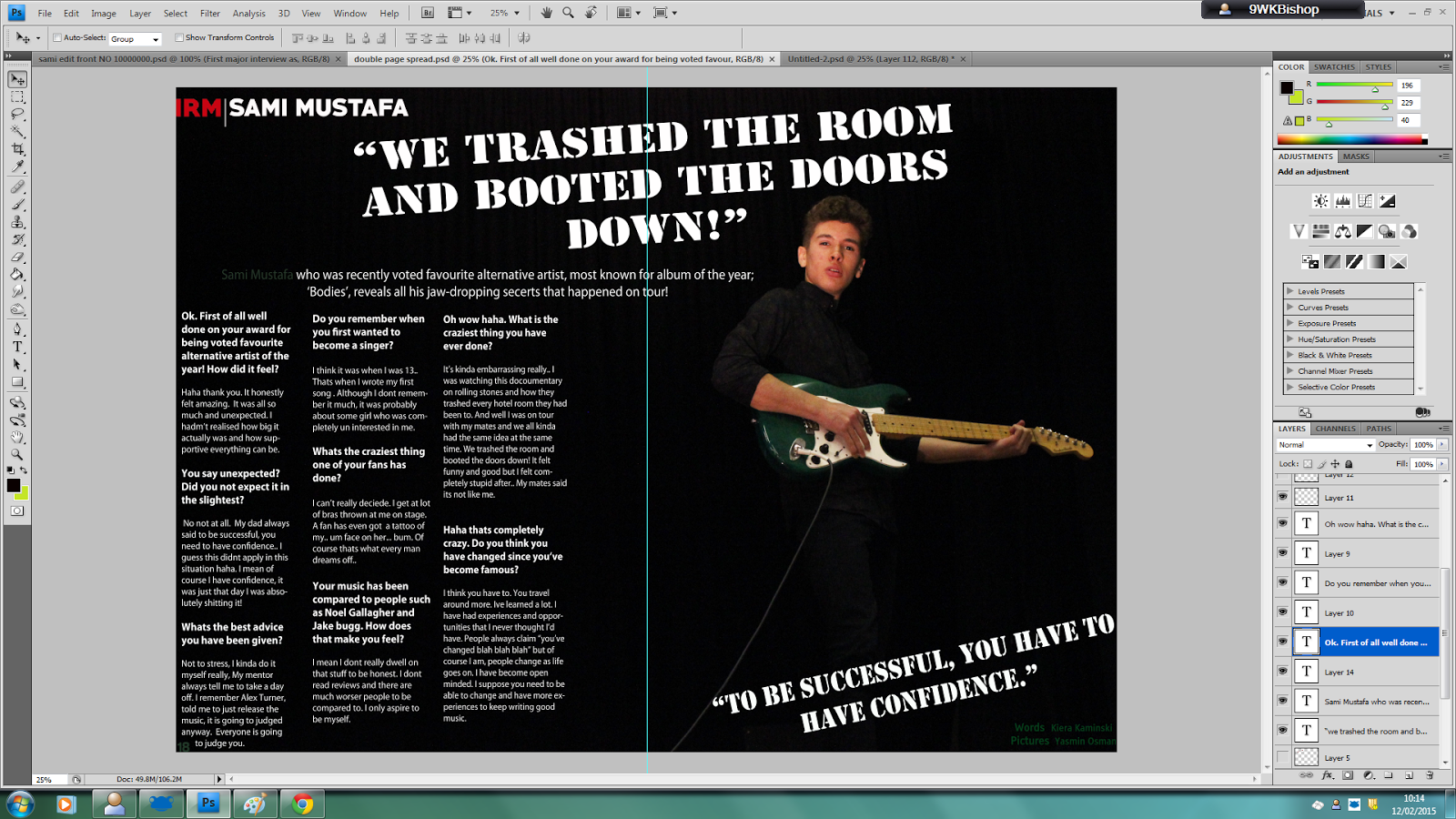
I also edited the double page spread, for the artist to stand out more by changing the size of the background image, making the artist larger, to emphasise the importance of the artist. I also changed the brightness of the double page spread to make the article easier and clearer to view.
No comments:
Post a Comment